
Smart Surveys / FAQ
Create a Smart Survey

NEW SURVEY
When you click on the New Survey button, you’ll see a New Survey dialog. On the dialog you’ll see the following options.
Name for your New Survey
How you want to save survey answers
You can save it as a Merge Tag
You can save it as a Group
You can save it as a Tag
A toggle to collect additional data
Survey Design

DESIGNING YOUR SURVEY
There are two editors, one for the Survey and one for the Survey Results your customers see when they’ve answered the Survey.
The Survey Editor consists of 4 main areas.

AREA 1: TOP BAR
The Top Nav bar consists of:
Arrow = Takes you back to the Files Page
Survey Name
Save Button = Saves Survey
Embed Button = Brings up Embed Dialog for the Survey and Survey Results
Gear Icon = Survey Settings
The Top Tool bar consists of:
Add: Text (icon) = Adds Text Block onto the Canvas
Add: Image (icon) = Adds Image Block onto the Canvas
Add: Clickable Area (icon) = Adds Clickable Area onto the Canvas
Canvas Zoom (dropdown) = Zooms In / Out Canvas
Survey Tab nav = goes to Survey Editor
Results Tab nav = goes to Survey Results Editor

AREA 2: CANVAS
The Canvas area is like most design tools you may have used in the paste. When you add a Text Block, Image Block, or Clickable Area Block, it appears on the Canvas. You can select it to resize a Block or to move a Block.
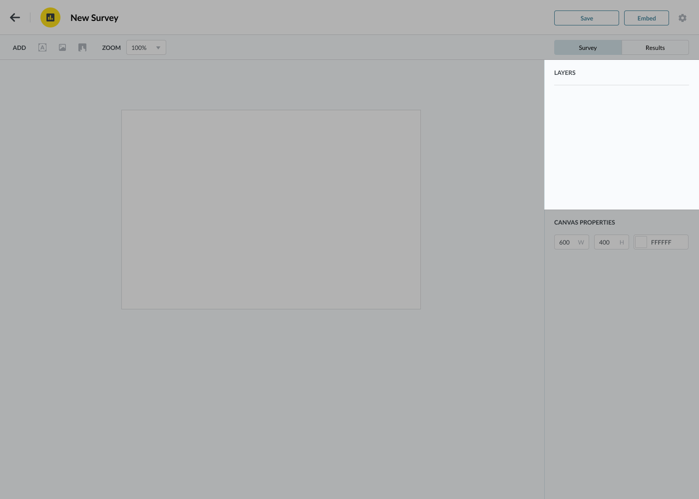
AREA 3: LAYERS
The Layers area shows you all of the Blocks you’ve added onto your canvas. When you hover over a layer, you’ll see additional options like Locking the Layer (so you can’t select it) and a two sided arrow pointing up & down on the right which you can click, hold, and move to re-order the Z-Order of the Block.

AREA 4: PROPERTIES
The Properties area shows you the options you have on a selected Block. When nothing is selected, the Properties area will show you the properties for the Canvas.
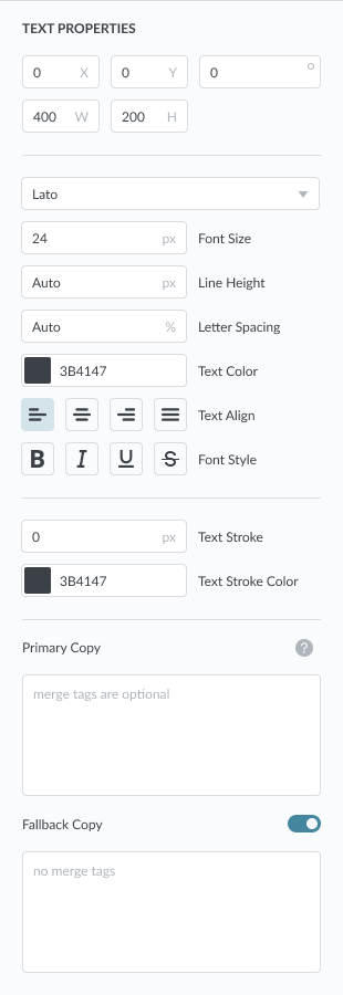
AREA 4: PROPERTIES — TEXT BLOCK
The Text Properties has the most options. They are (from top to bottom)
X = X location of the Text Block
Y = Y location of the Text Block
Rotate = Degree to rotate Text Block
W = Width of Text Block
H = Height of Text Block
Font Family = Dropdown list of Fonts for the Text Block
Font Size = Size of the Copy in your Text Block
Line Height = Line Height of the Copy in your Text Block
Text Color = Color of the Copy in your Text Block
Text Align = Align the Copy in your Text Block
Font Style = Style the Copy in your Text Block
Text Stroke = The Stroke width of the Copy in your Text Block
Text Stroke Color = The Stroke color of the Copy in your Text Block
Primary Copy = Text Area for the Copy in your Text Block
Primary copy supports Merge Tags. For example, you can have “Hello *|FNAME|*” and it will replace the Merge Tag with the First Name of your contact.
Fallback Copy = Text Area for the Copy in your Text Block
Fallback copy is what is shown your contact if they do not have any data in the Merge Tag. For example, if you had “Hello There!” as the fallback copy and your contact did not have a First Name in the *|FNAME|* Merge Tag, they would see “Hello There!”

AREA 4: PROPERTIES — IMAGE BLOCK
The Image Properties have two states. One state when the Image Block is empty and one when an image is added to the Image Block. Regardless of the state these properties are consistent.
X = X location of the Image Block
Y = Y location of the Image Block
Rotate = Degree to rotate the Image Block
W = Width of the Image Block
H = Height of the Image Block
When the Image Block is empty, you’ll see an option to “Drag & Drop Image”
You can either drag & drop an image onto this area to add an image or you can click on it to bring up the file finder to select an image file
When the Image Block has an image, you’ll see a preview of the image, the name of the image, and the size of the image.
You can click on the “Replace” link to bring up the file finder to select an image file to replace the existing image.
You can click on the “Remove” link to remove the image in the Image Block, making it empty again.
AREA 4: PROPERTIES — CLICKABLE AREA
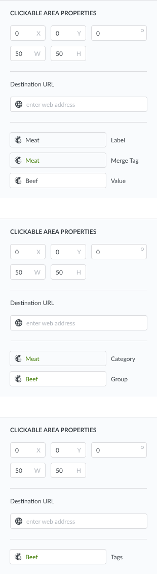
When you add a Clickable Area, you can define the following properties.
X = X location of the Clickable Area
Y = Y location of the Clickable Area
Rotate = Degree to rotate the Clickable Area
Destination URL
You can enter the URL of the webpage you’d like your customers to go to when they click on the Clickable Area
You can leave it blank, at which only the Survey Results will be shown
When you first created the Survey, the New Survey asked what format you wanted to save your Survey Results, this is where that comes into play.
Save survey answers as Merge Tag
Label = shows you the Label of the Merge Tag
Merge Tag = shows you the Merge Tag
Value = the text value that will be added to the Merge Tag of the Profile of your customer that clicked on the Clickable Area
Save survey answers as Group
Category = shows you the Group Category name
Group = the Group that will be added to the Group Category of the Profile of your customer that clicks on the Clickable Area
Save survey answers as Tag
Tag = the Tag that will be added to the Profile of your customer that clicks on the Clickable Area
Survey Results Design
DESIGNING YOUR SURVEY RESULTS
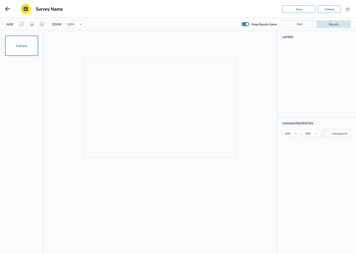
The Survey Results editor has a very similar layout to that of the Survey Editor. There are a few differences.

TOP BAR DIFFERENCES
The Survey Results top bar has a few minor differences. On the Top Tool bar, we have the following differences.
NO clickable Area = you can not add clickable areas on Results
Add Survey Results = adds a chart showing the Survey Results
Toggle Keep Results Same
ON = Shows the same Survey Results regardless of which clickable area your customers clicked
OFF = Shows a unique Survey Results based on which clickable area your customers clicked

NEW: RESULTS CANVASES
This new area shows the Results Canvases you can design. When the “Keep Results Same” toggle is ON, you will only see one Canvas labeled “Fallback.” When the toggle is OFF, you will see the “Fallback” Canvas and a Canvas for each clickable area.
You can click on the Canvas on the right to switch between the Results Canvases so you can customize each if you choose.

SURVEY RESULTS PROPERTIES
When a Survey Results Chart is added to the canvas and is selected, you’ll see the properties for that Chart.
X = X location of the Survey Results Chart
Y = Y location of the Survey Results Chart
Rotate = Degree to rotate the Survey Results Chart
W = Width of the Survey Results Chart
H = Height of the Survey Results Chart
Radius = Radius of the Survey Results Chart
Chart Dropdown = List of Charts for your Survey Results
Survey Options = Shows all of the clickable areas
You can change the color
You can reorder how the clickable areas will be displayed on the Survey Results Chart
FAQ: Smart Surveys
CAN THE SURVEY BE CUSTOMIZED IN TERMS OF DESIGN AND THE QUESTIONS ASKED?
Yes! Our Smart Survey editor is simple but powerful. You can add any image you like to express your brand and your voice. Once you’ve gotten the survey as you like it, you simple add the Clickable Areas over the answers of the Survey.
CAN SURVEY RESPONSES BE AUTOMATICALLY SEGMENTED INTO DIFFERENT MAILCHIMP GROUPS OR TAGS BASED ON THEIR ANSWERS?
Yes! If your segmentation isn’t complex and is based on Groups and Tag. When your customers click on a Survey Answer, they will be added to a Group or a Tag will be added to their Profile in your Mailchimp Account.
CAN A SPECIFIC FOLLOW-UP EMAIL BE SENT AUTOMATICALLY TO CUSTOMERS BASED ON THEIR ANSWERS?
Yes! But this is done in Mailchimp through their Journeys. Smart Surveys can help in this process. The clickable areas (on top of the Survey Answers) can be associated with Merge Tags, Groups, or Tags. When your customers click on the clickable area data is added to their Profile. You can create a Mailchimp Journey using this data.
For Example:
You can have the the tag “PURSE” added when customers click on a survey answer.
In Mailchimp, you can setup a Journey that is triggered when a Profile has the “PURSE” Tag added.
WHAT IS THE USER EXPERIENCE FOR MY CUSTOMERS THAT GET THE SMART SURVEY?
Super smooth. Email design is very technologically limited in what it supports. We’ve followed all of the technical requirements so that the Survey displays correctly on all email clients.
Your customers will see the Smart Survey as an embedded image in their email. They can click (or tap if they are viewing your email campaign on their smartphones) on the survey answer directly in the email. They will NOT be taken off the email to some other webpage to take the survey.
When your customers click on an area that does not have a Clickable Area, nothing will happen. When they click on a Clickable Area, they will either be taken to a webpage (specified by you) or open a new tab with the Survey Results image (if you did not specify a destination webpage).
BESIDES EMBEDDING THE SMART SURVEY IN MY MAILCHIMP EMAIL CAMPAIGNS, CAN IT BE DISTRIBUTED THROUGH OTHER CHANNELS?
No! Because Smart Forms is all about collecting and associating survey answers to the correct Profile in your Mailchimp account, it only works when it is embedded into your Mailchimp Email Campaign.
DO YOU PLAN TO SUPPORT OTHER EMAIL SERVICE PROVIDERS LIKE HUBSPOT OR CONSTANT CONTACT?
Not at this time. If we get a lot of feedback from our users that they would like us to support other ESPs, we can look into their API to see what is possible and not possible. So if you’d like to see us support additional ESPs, please let us know!
HOW MANY SMART SURVEYS CAN I CREATE?
As many as you want.
You can create multiple Smart Surveys for your various Mailchimp Accounts and/or Mailchimp Audiences.